
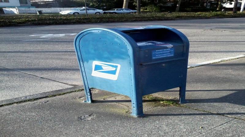
Curb appeal often comes down to details people barely register consciously. A trimmed lawn and a fresh coat of paint do most of the heavy lifting, but the smaller exterior touchpoints — the door handle, the porch light, the mailbox — quietly determine whether a home looks finished or merely maintained. Of those pieces, the mailbox is the one most homeowners overlook. It sits closest to the street, gets photographed in nearly every real estate listing, and absorbs daily wear from sun, rain, and weather extremes. Yet it usually receives the least design thought. Rethinking the mailbox, particularly its address numbers and overall finish, is one of the fastest ways to lift the appearance of an entire frontage.
The Mailbox as a Curb Appeal Anchor
When a stranger drives past a home, their eye lands on a small set of high-contrast features before settling anywhere else. The mailbox is almost always one of them, partly because of its position at the curb and partly because the address numbers act as a natural focal point. A faded plastic mailbox with peeling stickers undermines everything else the homeowner has invested in. A well-proportioned, properly finished mailbox does the opposite — it signals care and elevates the perceived quality of the home behind it.
This effect is not subtle. Real estate photographers regularly reframe driveway shots specifically to include or exclude the mailbox depending on its condition. Buyers may not consciously analyze the hardware, but they form impressions instantly, and those impressions stick.
What mailbox details improve curb appeal the Most?
A mailbox attracts attention before visitors notice landscaping, exterior lighting, or front-door hardware. Faded decals, thin plastic lettering, and uneven spacing weaken the appearance of an otherwise clean exterior. Decorative upgrades work best when every detail supports the home’s architectural style and improves visibility from the street. Many homeowners upgrade to mailbox numbers for curb appeal because clear address numerals create a sharper focal point, strengthen exterior symmetry, and make the mailbox look intentional instead of purely functional.
Raised metal numbers add depth and shadow that flat stickers cannot create. Matte black finishes pair naturally with contemporary trim, while brushed metal complements stone, brick, and neutral siding. Larger sans-serif numerals improve readability for delivery drivers and guests without making the mailbox feel oversized. Proper spacing also changes how polished the installation appears. Crowded numbers reduce legibility and make even expensive hardware look poorly aligned. Reflective or lightly contrasted finishes help maintain visibility during evening hours while preserving a clean daytime appearance. The mailbox itself gains more visual weight when address numbers match nearby fixtures such as sconces, door handles, or gate hardware. Consistent finishes tie the entryway together and create stronger curb presence from the sidewalk or street view. Small exterior details rarely transform a facade alone, but coordinated mailbox lettering changes how the entire frontage feels at first glance.
Choosing a mailbox that reflects the Home’s Character
A good mailbox decision starts with reading the home itself. Architectural style sets the tone for everything else — the silhouette, the material, and the finish should all extend the visual language of the facade rather than compete with it. A boxy modern home asks for clean horizontal lines, low-profile post mounts, and tight typography. A traditional Colonial reads better with classic post-mounted mailboxes finished in deep matte tones, with serif or classic sans-serif numerals that feel age-appropriate. Mediterranean and Spanish-style homes often pair well with wrought-iron mounts and warmer metal finishes that pick up the tones of stucco and clay roofing.
Avoiding the Most Common Style Mistakes
The biggest curb appeal mistakes tend not to be exotic — they are usually defaults left unchallenged. A standard plastic mailbox installed by a previous owner, an HOA-issued aluminum unit weathered past its prime, or a decorative novelty mailbox that fights the home’s architecture are all common offenders. Apartment Therapy ran a useful piece on mailboxes designers wish homeowners would stop installing, and it captures the patterns worth avoiding before any upgrade investment is made.
Why Address Numbers Carry Most of the Visual Weight
Even on a beautifully designed mailbox, the address numbers do most of the communicative work. They are the part of the assembly that visitors actually read, and they are usually the first place the eye lands. Cheap stick-on numbers age poorly under direct sun. Within a year or two, edges curl, vinyl yellows, and adhesive residue stains the surface beneath. The result is a mailbox that looks neglected even when the rest of the home is well-kept.
Solid metal numerals, mounted with standoffs that lift them slightly off the surface, solve several problems at once. They cast soft shadows that read clearly from the street, they hold their finish across years of exposure, and they introduce a subtle dimensional quality that flat lettering cannot replicate. The same logic applies to acrylic numerals on lighter-weight wall-mounted mailboxes, where weight and edge cleanness matter more than mass.
Coordinating the Mailbox With the Wider Outdoor Setting
Curb appeal works as a system rather than a collection of individual upgrades. The mailbox should sit comfortably within the broader outdoor scheme — the planting beds, the driveway material, the walkway lighting, and any garden or patio elements visible from the street. When these pieces share a finish family or material vocabulary, the whole frontage starts to feel composed rather than assembled. For homeowners thinking about how the mailbox fits into a larger outdoor refresh, this guide on transforming an outdoor living space offers useful framing for how exterior design choices reinforce one another.
Practically, this means resisting the urge to treat the mailbox as a one-off purchase. If your house numbers, sconce finishes, and door hardware are matte black, the mailbox numerals should fall into the same finish family. If brushed nickel runs through the rest of the entry, introducing a sharply different tone at the curb breaks the rhythm. Modest consistency does more for curb appeal than any single dramatic upgrade.
Scale, Spacing, and Legibility
Three technical factors determine whether mailbox lettering looks deliberate or accidental: numeral height, spacing, and contrast. For most post-mounted mailboxes viewed from the street, numerals between four and six inches tall strike the right balance — large enough to read at distance, restrained enough to avoid overwhelming the mailbox face. Wall-mounted units near a front entry can usually accept slightly smaller sizing because the viewing distance is shorter.
Spacing matters more than most homeowners realize. Numerals jammed too close together lose definition and look amateur regardless of their material quality. A consistent gap, generally about a third of the numeral’s stroke width, gives the address breathing room and reads cleanly from across the street. Contrast handles the rest. Dark numerals on a light mailbox or light numerals on a dark mailbox preserve legibility in low-evening light, when delivery drivers and guests need it most.
A Word on Modern House Numbers
Modern House Numbers is one of the more design-forward names in the address hardware category. Their work centers on architecturally minded numerals and lettering — clean typography drawn from contemporary design conventions, durable finishes engineered for outdoor exposure, and mounting hardware that delivers the precise float-mount shadow lines associated with high-end exteriors. The catalog spans matte black, brushed stainless, satin brass, bronze, and aluminum, with sizing options that fit anything from compact wall-mounted mailboxes to larger curbside posts. For homeowners who treat the entry as part of a larger architectural composition rather than an afterthought, the brand offers the kind of finish quality that holds up across years of weather without losing its edge.
Bringing It Together
A better mailbox design rarely costs much, and the curb appeal return on it is disproportionate to the investment. Replace faded vinyl numbers with solid metal numerals. Match the finish to the rest of the entry hardware. Choose a mailbox silhouette that respects the architectural style of the home rather than fighting it. Pay attention to numeral height, spacing, and contrast, because those technical details separate a mailbox that looks deliberate from one that looks tolerated. None of these steps requires a contractor or a major renovation budget, but together they shift how the entire frontage reads from the street. That is the quiet logic of curb appeal — small, coordinated decisions producing a noticeably better whole. See more: homenumental.com.